The content of this page is classified and not approved for circulation
GlaxoSmithKline (GSK) Pharmaceuticals
Duration: 2017 – 2018
Goal:
In preparation for ADVAIR’s patent expiration and loss of exclusivity, GSK pharmaceuticals wanted to target HCPs to request samples and coupons in order to minimize a potential decline in prescriptions written.
Solution:
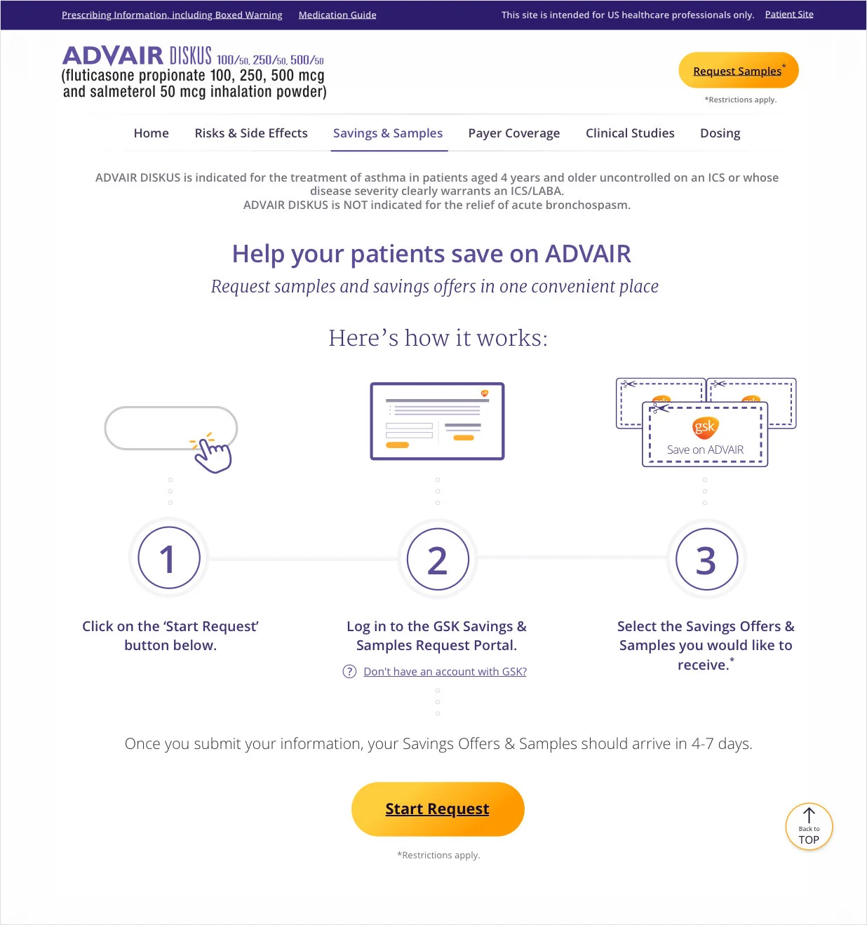
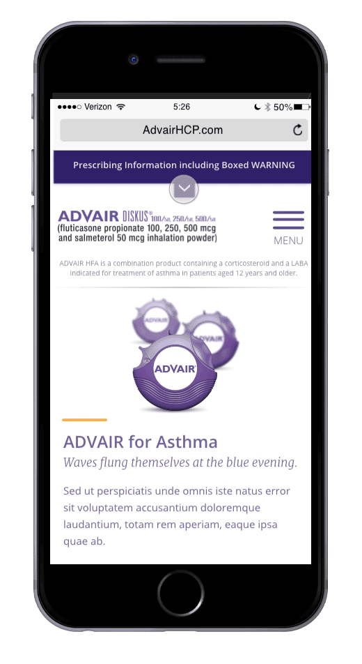
Step 1 included looking at physicians’ prescribing behavior and modeling a customer journey around their daily digital experiences and touch points. This led me to start by modernizing the brand’s digital presence by updating the brand presence. As for the website, using proven data, analytics, design psychology, and knowledge of user interaction, I created a modular, conversion-centric website that saw a 16% increase in script lift throughout its launch in late 2017.
Customer Journey, Design System Rebrand & Content Strategy


Layout Strategies
Modular Layout
A module is a reusable component that, in combination with other modules, can be constructed into a complete various webpages or customized landing pages.
Modular designs allow for reuse, rapid testing efforts, and incremental upgrades as opposed to full redesigns.

“F” Pattern Layout
The Advair site is designed with an “F” Pattern User Interaction in mind – that is, the user visits a page and starts viewing content in the top left corner, then scans to the right.
Within the hero section, content & negative space is used to direct user focus on the Call-to-actions (CTAs).

Negative Space
1 . The required content is immense. So I utilized circular graphs and shapes to create negative / white space that allow the pages to “breathe.” This open space helps fight visitor eye fatigue when scanning or reading the daunting amounts of copy. The use of negative space also helps create a feeling of transparency.
2 . On mobile, the negative space helps speed up scrolling, digestion of information, and saves time for the user. Utilizing a sticky header and “back to top” button ensures the user can continue on their journey no matter where they are on a page.
3 . The layout on content-heavy pages mimics that of a medical textbook, so it allows the HCP to quickly scan the subheadlines and graphs, controlling their own journey while subtly directing them to request samples or coupons.

Exploration of Menu Interactions

Existing Design
Index/Homepage

Subpage

Redesign
Index/Homepage

Subpage Examples